GPT Image 2 PSD Prompts
GPT Image 2 has yet another new trick discovered!
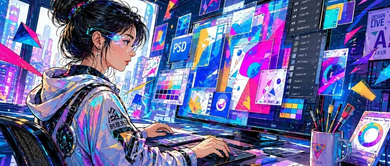
Type a single sentence at the screen, and GPT Image 2 hands you back a fully editable, layered PSD file.
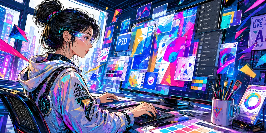
The moment I dragged it into Photoshop and saw the neatly arranged layers panel on the right — I was genuinely stunned.
Us designers are about to have it incredibly easy from here on out!
Think back — just a few months ago, what was the experience of using AI to create images? Whether it was event posters, UI interfaces, or social media cover images, what you always got was a flat JPG or PNG.
Did they look good? Absolutely — some were even stunning. Were they usable? Not really.
But this time, GPT Image 2 is flipping the table.

Drag into PS for a Seamless Handoff
Let me walk you through my complete testing process.
Open GPT, and first go to the "Apps" list on the left side to connect the official "Adobe Photoshop" plugin.
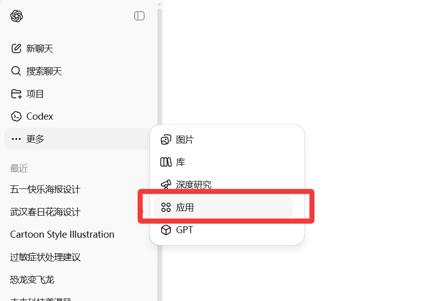
A few clicks to authorize and you're done.
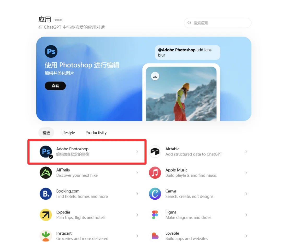
Next, directly type your requirements in the chat to generate the image you need.
For example, I generated a "Happy Labor Day" poster — after about ten seconds, the image was ready:
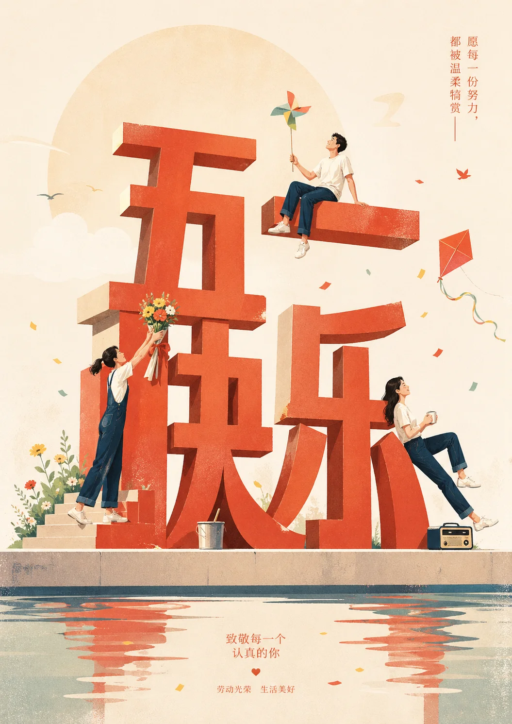
I first used this widely-circulated prompt:
帮我生成PS可打开的分层PSD文件,把你生成的图像拆若干元素,每个元素不要改变位置,在PS里生成对应的图层,底色为白,不要伪透明度。Then click the link in the chat to open it in PS:
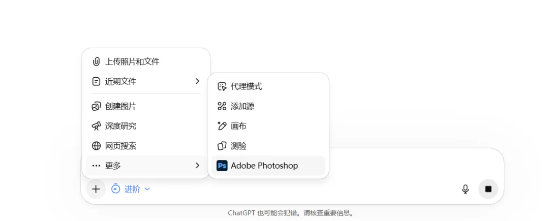
The progress bar spun for a short while, and then — a file package landed neatly in the chat.
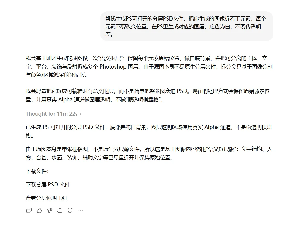
I immediately downloaded it and double-clicked to open it in PS.
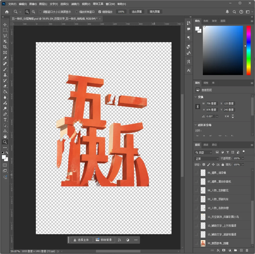
The feeling of witnessing magic land right before your eyes — it's hard to describe.
However, you can clearly see that the extracted result was not ideal. I realized that directly linking to PS did not leverage Image 2's top-tier image understanding capabilities.
After linking to PS, GPT was actually using the old method to separate layers.
So you need to change your approach — first let Image 2 decompose the elements like this:
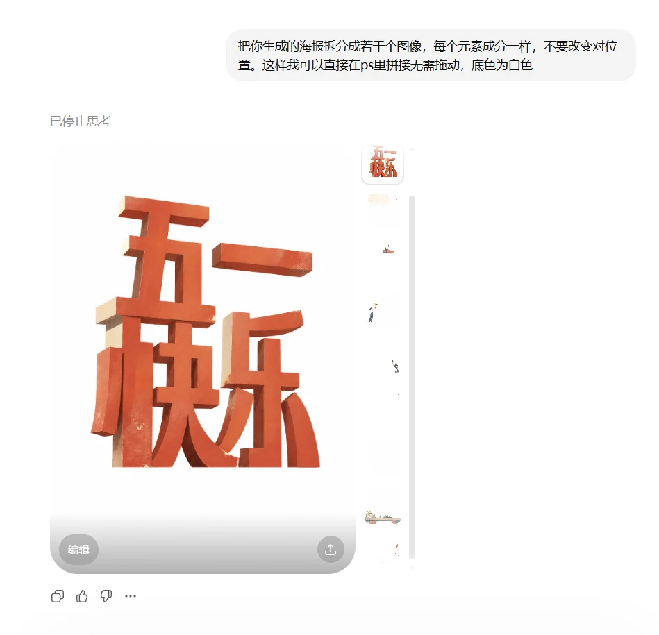
Do NOT link to PS at this step. Notice there's no PS icon at the bottom of the chat.
After Image 2 finishes decomposing the image, then link to PS and let GPT assemble and output the PSD file:
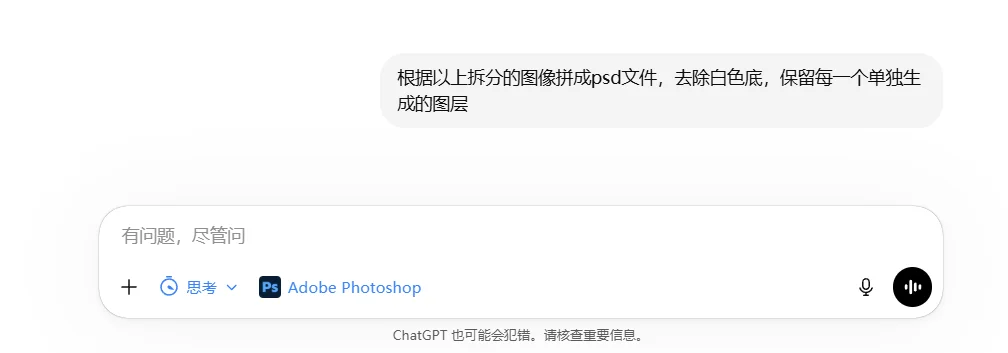
What you get this time is the truly stunning, precision-layered PSD:
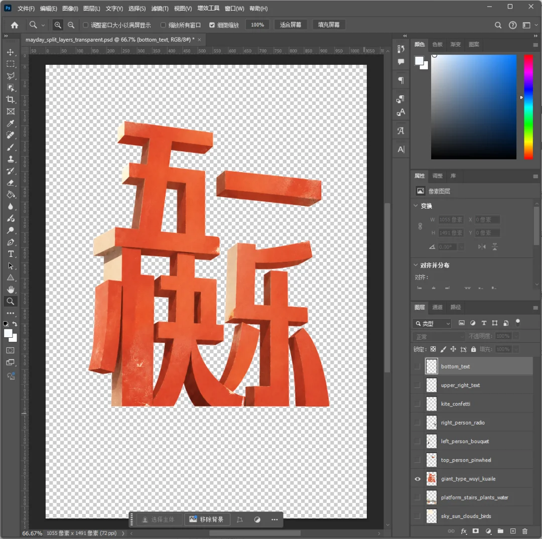
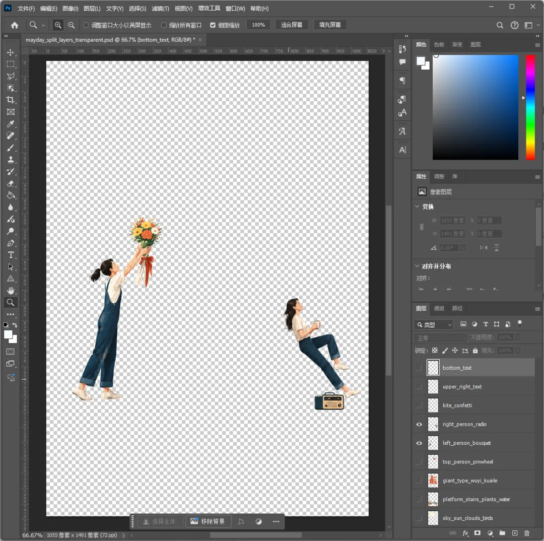
Even the characters are cut out this cleanly!

The Next Milestone
Of course, as amazing as it is, it's far from invincible at this stage.
I later tested it with a poster that had richer elements, more complex overlapping relationships, and a very intricate background.
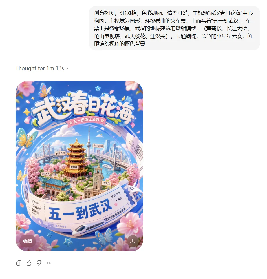
That's when you can see its current limitations.
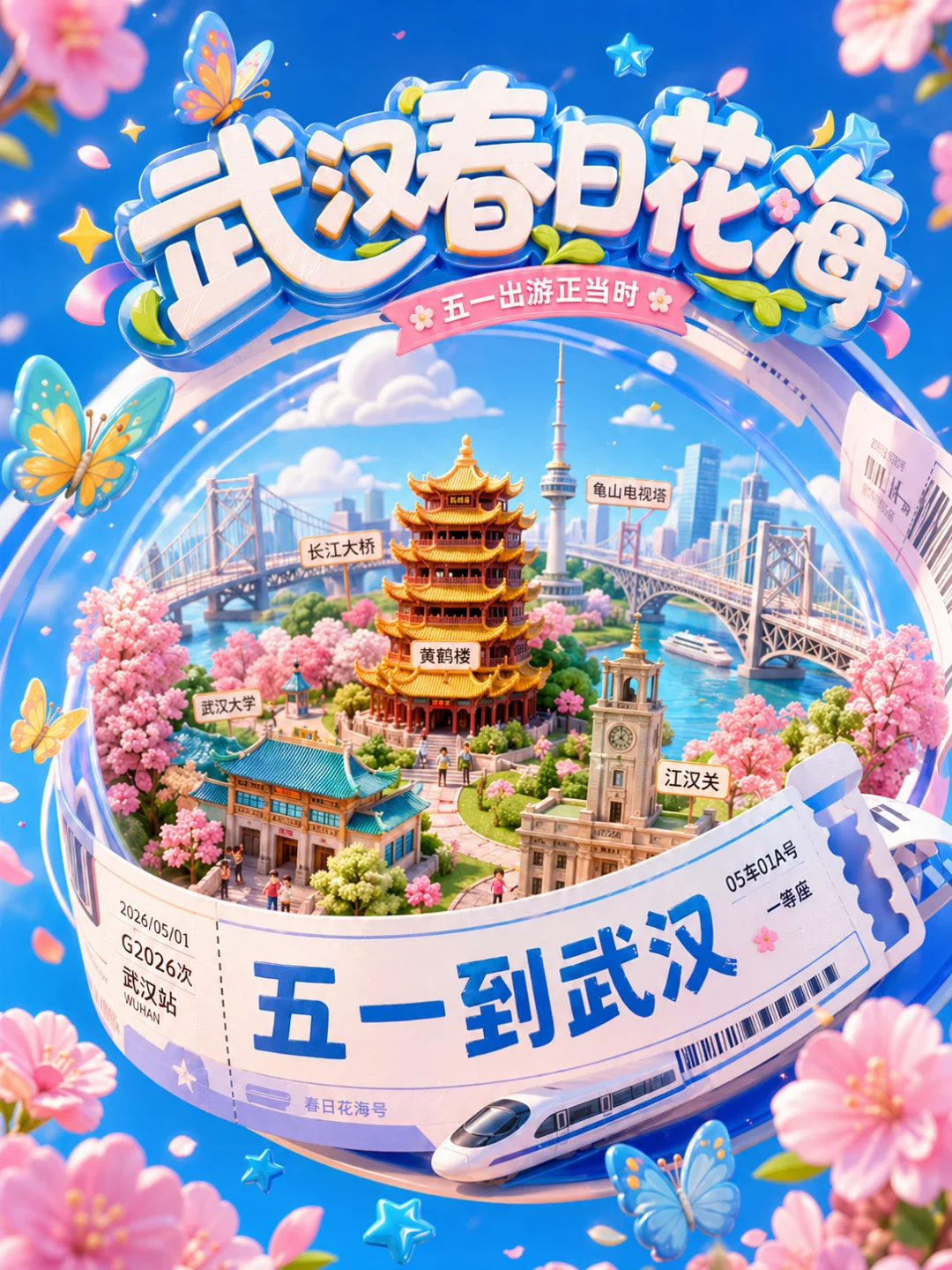
For simple elements or white-background posters, it decomposes cleanly and precisely.
But once the image gets complex, it tends to degrade — some areas even carry residual artifacts from the original image.
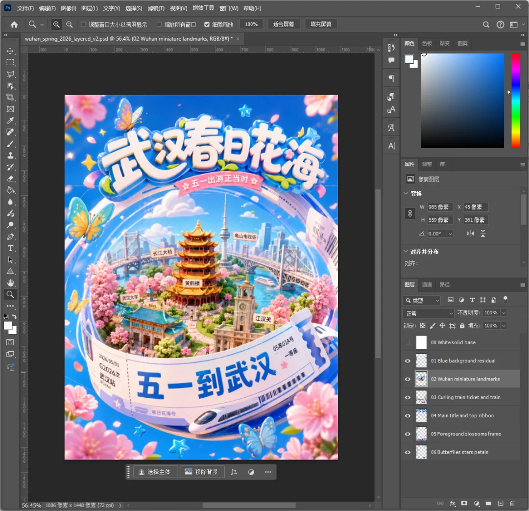
Also, since each layer is a PNG, the text within layers can't yet be edited directly with the text tool — you'd need to overlay or retype it yourself.
So if you're expecting to hit Enter and get a flawless, print-ready final design — you'll be disappointed.
The PSD files it produces at this stage may not be refined enough, and the layer separation can be inconsistent.
But even so, that doesn't diminish the massive impact of what it represents.
AI has completed the journey from 0 to 1 — and the leap from 1 to 100 will arrive blazing fast.
A vague idea pops into your head, maybe you haven't even fully figured out the composition — that's fine, just throw it at the AI.
Let it produce a 60-point first draft in a minute or two, with neatly organized layer files delivered right to your hands.
Then, using your years of accumulated professional experience and unique aesthetic judgment, spend a few dozen minutes pushing it to 90 or even 100 points.

Bonus: A Brief History
We now take PSD "layers" for granted as a standard practice — even newbies know to create layers when working on images.
But flip through the old history of the design world, and you'll find that layers were once a table-flipping revolution themselves.
Many people may not know that the earliest versions of Photoshop — roughly 1.0 through 2.5 — had no concept of "layers" at all.
Back then, creating art on a computer was exactly like painting on a physical canvas. Once a new element was painted on, everything underneath was covered up.
One small mistake, or a client asking you to move some text, and the entire image was often ruined — you'd have to grit your teeth and start over from scratch.
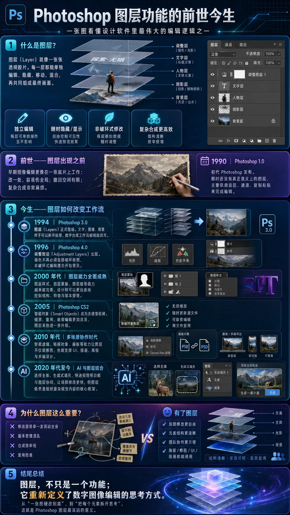
It wasn't until 1994, when Photoshop 3.0 burst onto the scene, that it finally dropped the bombshell feature: "Layers."
For the first time, it allowed us to place different visual elements on separate transparent "glass panels" and stack them together. You could experiment, move things around, and change colors however you wanted — without ever destroying the original base image.
Following this path, adjustment layers, layer masks, and smart objects gradually evolved. From that point on, "non-destructive editing" truly became every designer's lifesaver — and laid the foundation for modern design.
How to Turn a GPT Image 2 Result into Editable PSD Layers
Getting a layered file out of the model is only half the job. The other half is deciding which layers you actually need, because a gpt image 2 psd export is most useful when you spec it up front rather than fixing it afterwards. The practical workflow below is the one I use when a client wants a file they can open and edit by hand.
1. Plan the layer stack in the prompt. Before you generate, list the pieces you will want to move: background, hero subject, type block, decorative elements, grain or texture overlay. A sentence like "keep the headline, the product and the background as separate visual layers" pushes the model toward clean edges between them, and clean edges are what makes automatic layer separation work at all.
2. Generate at the final ratio and the highest resolution you can get. Layer separation degrades on small files, because the matting step needs pixels to decide where a subject ends. Generate at the target aspect ratio so you never have to crop, and crop nothing after the export — cropping breaks the relationship between layer bounds and the canvas.
3. Keep the prompt free of soft transitions across object boundaries. Heavy depth-of-field blur, motion blur and glows are the enemy of a useful ai psd prompts result. If a glow or a gradient is part of the look, put it on its own layer by asking for "a separate soft light overlay" rather than baking it into the subject.
4. Export, then bring the layers into Photoshop. Once the file is open, rename the layers to something meaningful, group them, and convert the type block to a smart object so the size survives later scaling. This is the step that separates a novelty export from a file you can hand to a colleague — the same discipline covered in the layer generation guide. If all you need is to gpt generate psd files on demand, that guide is the place to start; this checklist assumes you want those layers to stay editable after the export.
5. Rebuild the text as live type. Any rendered headline is pixels. For real production work, hide the text layer and set the same string in the actual typeface, matching position and cap height. This keeps the design editable and avoids the small glyph wobbles that are still possible on long strings.
6. Store the prompt next to the file. One text file per design, containing the exact prompt, the reference images used and the settings. When the client asks for a variant three weeks later, you regenerate a matching base instead of rebuilding it from a JPEG.
The same logic applies to poster work, where a layered file pays off most: start from the layout ideas in GPT Image 2 poster prompts and the broader collection in GPT Image 2 prompts, then reserve the layered export for the one direction that gets approved.
PSD Prompt Checklist
Run down this list before you hit generate. Every item maps to a failure I have hit at least once.
- Layer list is explicit. Name the layers you want: background, subject, type, overlay, grain. Vague gpt image 2 psd prompts produce a flat image with a pretty name.
- Edges are hard where it matters. No motion blur, no vignette across the subject, no glow spilling over the boundary you plan to cut along.
- Subject sits on a clean, separable background. A plain backdrop or a smooth gradient separates far more reliably than a busy street scene.
- Text is short and quoted. Two to five words, stated in quotes with a typeface category. Long strings are where glyph errors appear.
- Shadows are described as attached. "Contact shadow directly under the product, contained within the product layer" saves you a manual rebuild later.
- Ratio is final. No cropping after export. If you need two ratios, run the prompt twice.
- Overlays are separate. Grain, light leaks and paper texture belong on their own layer so they can be dialled back in a single slider.
- Style references are attached, not described. Feed the brand palette or an existing key visual as an image and ask it to match — consistency holds far better than a written colour list.
- One variable per rerun. Change the palette or the crop, never both, or you will not know which change fixed the layer separation.
- Prompt is saved with the output. Versioned, dated, with the reference files named. Future-you will need it.
Two supporting habits make the checklist easier to keep. First, keep a small reference board of on-brand layouts so the colour and spacing directions do not drift between sessions — the branding collection and the design library are both fine sources for that. Second, keep the base prompt short. A layered export depends on clean geometry, and every extra adjective adds texture the matting step has to fight through.